A Logo Story: Corpus Christi Anglican
Many of the churches in the Diocese have very intentional logos used as a part of their church’s story and mission. Corpus Christi Anglican shares their logo and its meaning below. Stay tuned for more Logo Stories from around the Diocese!
by Moran Reed
How we got our name
In April 2021, we began to meet weekly in our backyard for morning prayer. I had been struggling with what to name our church plant. At the time we were called the Franconia-Springfield Mission, which was a placeholder until we could think of something better. How do we describe something that is approachable and Anglo-Catholic, local, hospitality-driven, and committed to the BCP and great tradition of the Church? At the time I was reading E.L. Mascall, Corpus Christi: Essays on the Church and the Eucharist. My wife, Ashley, noticed the book on our table and when I told her I was really struggling to find a name she pointed to the book and said “Why don’t you just call it Corpus Christi?” That felt to me like the voice of the Holy Spirit. Ashley had put her finger on something that brings together the hospitality and approachability of our community and the love for the great Tradition of the Church!
How we got our logo
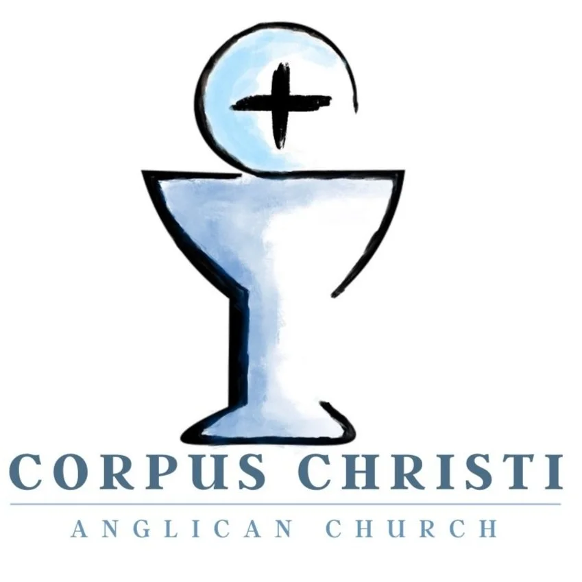
After deciding on the name “Corpus Christi Anglican Church” we had to create a logo that would communicate approachability, reverence, and our vision. Our vision is to become a common people in common prayer for uncommon transformation. Each week the priest and congregation face the same direction to offer the Eucharist, to come to a feast where we join in the worship of heaven with angels, archangels, and all the company of heaven, to receive the grace of God and to live out the work God has given us to do; to become a sacramental community for the life of the world. The Eucharist is the backbone of spiritual progress and the foundation for a rule of prayer. If the Holy Spirit can change the bread and wine into the body and blood of Christ, then He can do the miraculous and transformative work of bringing our dusty selves into union with God. The chalice and paten feature prominently in our logo because the Sacraments are a primary means of grace and the hope of glory. Each week we elevate the host, hear a bell, and people are reminded to focus on the body of Christ. Each week we elevate the chalice, hear a bell, and people are reminded to focus on the blood of Christ. These elevations draw us into our mission as we take our eyes off of ourselves and set them on our Lord, Jesus, who can bring us life.
The Host & Chalice
The cross in the host focuses our attention on the death, resurrection, and ascension of Christ, which is what should be most exalted in our lives. The cross also communicates something unique to the Springfield area. The Springfield Interchange (i.e., the mixing bowl), always reminds me of a cross when I see it on a map. It reminds me that we are creating an ecclesiastical home for spiritual sojourners. We have military households, members from Greenspring Senior Living, people who will come and buy houses to stay in the area for a long time, and people who may only be here for the summer before going to the next place. We have had a wonderful college intern for 10 weeks and have been blessed to be a part of his journey. Jesus takes those who are wandering, makes them children of God, and sends them out as His disciples. The cross reminds us of the Interchange, that all of us to one degree or another are just passing through as God leads us elsewhere. In the midst of our pilgrimage, our church aims to welcome in all kinds of people to send them out again in the power of the Holy Spirit and to commission them for what God has for them.
The Colors, Textures, and Fonts
The soft colors, rough (almost unfinished) brush textures, and serif fonts speak to simplicity, approachability, and how imperfectly we come to Christ in community. We aim to do things with excellence, but we are not polished: we forget to make coffee, a child runs through the hallway and trips and screams during the middle of a service, a parent spills puffs all over the floor while juggling a toddler, the A/V system doesn’t work properly, we forget to print out parts of the liturgy, etc. I’m remembering the Bishop’s first visit to our church where we did not put out enough hosts and during communion I had to stop the line, put down the chalice, reach into my pocket (under my cassock) to get my keys to get more out of a locked storage closet and have him consecrate those hosts before we could keep going. We are a little (or more than a little) unfinished, but real life is messy and it is that mess that we offer — ourselves, soul and body — to the Lord.
The color scheme, serif fonts, textures, chalice, host, and cross all come together in our logo to invite all kinds of people into the Body of Christ. Anglo-Catholic spirituality (a commitment to the great Tradition of God’s global Church across time and geography) goes hand-in-hand with a desire for unfinished and messy people to find mystical and sweet communion together with Christ as he forms us into a Sacrament, the Church, to bring life to a messy world.
